Introduction
Many of the saas marketers have this question in mind: How to increase conversion rate? But before that lets understand what conversion rate is, it is the percentage of visitors who take a desired action, like signing up for a trial or purchasing. It’s the lifeblood of your SaaS growth. Without a strong conversion rate, all the traffic in the world won’t help your bottom line.
In this blog, we’ll dive into ten actionable steps to boost your conversion rate. From understanding your audience’s psychology to refining your value proposition and leveraging A/B testing, we’ve got you covered. Let’s turn those visitors into loyal customers and charge your SaaS success!
Understanding the psychology behind conversion
Why empathy and context are key to conversion
Why do people click that “Sign Up” button? It’s all about empathy and context. Understanding your users’ context, where they’re coming from, their needs, and pain points allows you to customize your approach. Empathy plays a crucial role here; when users feel understood, they’re more likely to engage.
Addressing users’ emotional states and motivations can significantly enhance conversions. Are they frustrated with a problem your product solves? Show them you get it. You build a connection that drives action by speaking directly to their experiences and offering solutions. Remember, it’s not just about features; it’s about making users feel heard and valued.
Understanding a conversion journey: from questions to actions
To boost conversions, you need to anticipate and address your audience’s concerns. Common inquiries may include: “What advantages will this service/product provide?” or “Is it worth the cost?” Offer clear and direct answers to these questions on your website.
Support your answers with evidence—data, customer testimonials, and case studies. This builds trust and credibility. For instance, showcasing a testimonial highlighting a significant improvement in a customer’s workflow can be very persuasive.
Finally, motivate users to take action. Use compelling calls to action and remind them of the benefits they’ll gain. When you combine clear answers with solid evidence, you guide users seamlessly from curiosity to commitment.
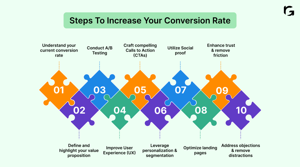
10 Actionable steps to increase your conversion rate

- Step 1: Understand your current conversion rate
- Step 2: Define and highlight your value proposition
- Step 3: Conduct A/B Testing
- Step 4: Improve User Experience (UX)
- Step 5: Craft compelling Calls to Action (CTAs)
- Step 6: Leverage personalization and segmentation
- Step 7: Utilize Social proof
- Step 8: Optimize landing pages
- Step 9: Enhance trust and remove friction
- Step 10: Address objections and remove distractions
Step 1: Understand your current conversion rate
1. Use analytics tools to calculate your current conversion rate
Tools like Google Analytics can help you track and calculate your conversion rate. Go to the “Conversions” section and set goals matching your desired actions, such as sign-ups or purchases. This will establish a baseline for measuring improvement.
2. Identify key metrics: conversion rate, bounce rate, and exit rate
Focus on key metrics within your analytics dashboard. The conversion rate shows the percentage of visitors completing desired actions. The bounce rate shows the percentage of visitors who exit after viewing just one page. The exit rate shows where users are dropping off. High bounce or exit rates may signal areas needing improvement.
3. Set realistic and measurable goals for improvement
Use your baseline data to set specific goals. For example, if your current conversion rate is 2%, aim for incremental increases, like reaching 2.5% in the next quarter. Make your goals SMART (Specific, Measurable, Achievable, Relevant, Time-bound). Your goal might be to reach 2.5% by optimizing your sign-up page and improving your call-to-action buttons.
Knowing where you stand and where you aim to go is the first step towards effective conversion rate improvement.
Step 2: Define and highlight your value proposition
1. Clearly state what makes your product unique and valuable
Identify your product’s key features and benefits. Focus on what sets it apart from competitors. Clearly communicate the specific problems your product solves and the tangible benefits it provides. For instance, if your SaaS product offers advanced analytics, highlight how it provides deeper insights than other tools. For example, “Our SaaS platform offers advanced analytics that provides deeper insights into user behavior, helping you make data-driven decisions faster.”
2. Ensure the value proposition is prominently displayed on your website
Position your value proposition in high-visibility areas like the homepage, landing pages, and product pages. Use compelling headlines, subheadings, and bullet points to make it easily scannable. Avoid clutter and ensure the value proposition is the focal point. On your homepage, use a headline like “Explore deeper insights with our advanced analytics,” followed by bullet points outlining key benefits.
3. Experiment with various value propositions
Use A/B testing tools such as Optimizely or Google Optimize to compare different versions of your value proposition. Experiment with various headlines, subheadings, and supporting text. Track engagement metrics to determine which version converts better. For instance, test two variations: “Unlock Deeper Insights” vs “Gain Actionable Analytics,” and measure which headline results in more sign-ups.
This focused strategy ensures your messaging connects with your audience and addresses their unique challenges.
Step 3: Conduct A/B testing
1. Decide what elements to test (e.g., headlines, CTAs, images)
Identify which site elements could significantly impact user behavior. For example, test both if you’re unsure whether a headline like “Get Started Now” or “Join Us Today” will drive more sign-ups. Similarly, experiment with different CTAs, such as “Buy Now” versus “Learn More,” or try varying images to see which resonates more with your audience.
2. Use tools like Optimizely or Google Optimize for testing
Set up your A/B tests using Optimizely or Google Optimize. These tools allow you to create different versions of your web pages and divide your audience so each group sees a different version. For instance, you can test a page with a green CTA button against a red CTA button to see which one gets more clicks. These platforms also provide detailed analytics to help you determine which version performs better.
3. Continuously test and refine based on the results
After launching your tests, monitor the results to identify statistically significant differences in user behavior. Suppose your test shows that “Join Us Today” leads to 15% more sign-ups than “Get Started Now.” Implement this winning headline across your site.
Step 4: Improve User Experience (UX)
1. Perform a UX audit to uncover areas of user frustration
Navigate your site as if you’re a user. Look for areas of frustration or confusion. Tools like Hotjar can help with heatmaps and session recordings, showing where users click and get stuck. Tools like Hotjar can help by providing heatmaps and session recordings, showing where users click and where they get stuck. Prioritize fixing the critical issues first. For example, if many users abandon their cart on the payment page, focus on simplifying that process.
2. Improve site speed using tools like Google PageSpeed Insights
Enhance site speed with tools such as Google PageSpeed Insights. The tool provides a score and specific recommendations, such as optimizing images or leveraging browser caching. Quicker load times improve user experience and increase conversion rates.
3. Ensure mobile optimization for all devices
Check your site on multiple devices to ensure it’s mobile-friendly. Use responsive design principles so your site looks great on any screen size. Google’s Mobile-Friendly Test can help identify issues. For example, adjust the font size if the text is too small to read on a smartphone.
Step 5: Craft compelling Calls to Action (CTAs)
1. Use clear, concise, and action-oriented language in CTAs
Your call-to-action (CTA) should clearly tell users what to do and what they will receive. For example, instead of “Submit,” use “Get Your Free Trial.” This tells users what action to take and what they’ll receive. Keep it simple and direct, like “Download Now” or “Sign Up Today.”
2. Experiment with different CTA placements and designs
Place your CTAs in various locations on your site to see what works best. For instance, try placing a CTA above the fold, at the end of a blog post, or in a sidebar. The design also matters; you should use contrasting colors to make your CTA stand out. For example, if your site’s primary color is blue, a bright orange CTA button can grab attention.
3. Use A/B testing to identify the most effective CTAs
Set up A/B tests to compare different versions of your CTAs. Test different versions by changing wording, color, placement, and size. For instance, compare “Get Started Now” with “Start Your Free Trial” or test a green versus red button. Use tools like Optimizely or Google Optimize to run these tests and analyze the results.
Step 6: Leverage personalization and segmentation
1. Use tools like HubSpot or Marketo for personalized content delivery
Personalization tools like HubSpot and Marketo help tailor content to individual users based on their behavior and preferences. For example, if a user frequently visits pages about email marketing, HubSpot can automatically send them targeted content about advanced email marketing strategies.
2. Segment your email lists based on what users do and what they like
Divide your email lists into segments based on criteria such as purchase history, browsing behavior, or demographics. For instance, segment users who have signed up for a free trial but haven’t converted and those who actively use specific features. Tailor email campaigns to each segment. Active users might get updates about new features, while inactive users receive re-engagement emails with special offers.
3. Make separate landing pages for different groups of your audience
Use tools like Unbounce or Instapage to create landing pages tailored to different segments of your audience. For example, if you’re running a marketing campaign for a SaaS product, create separate landing pages for small businesses and enterprise clients. The small business page might highlight affordability and ease of use, while the enterprise page emphasizes scalability and advanced features.
Step 7: Utilize social proof
1. Collect and display customer testimonials on key pages
Reach out to satisfied customers and ask for testimonials. Display these on your home, product, and landing pages. For example, a testimonial saying, “This tool boosted our team’s productivity by 40%,” can significantly influence new visitors.
2. Showcase user reviews and ratings prominently
Encourage users to leave reviews and ratings. Highlight these prominently on your site, especially on product pages. For instance, if your SaaS tool has a 4.8-star rating from hundreds of users, showcase this to build trust and credibility. Integrate platforms like Trustpilot or G2 to display verified reviews.
3. Develop case studies highlighting successful client stories
Create detailed case studies that showcase how your product solved specific client’s problems. Include metrics and quotes to make the story compelling. For example, a case study showing how your software helped a company increase its sales by 50% provides concrete evidence of your product’s value.
Utilizing social proof is about showing potential customers that others trust and value your product.
Step 8: Optimize landing pages
1. Use clear headlines and subheadings to convey value
Your headline is the first thing visitors see, so make it count. Use clear, concise language that immediately conveys the benefit of your product. For example, “Increase Your Sales by 50% with Our Marketing Tool” is more compelling than a generic “Welcome.” Subheadings should support the headline by providing additional context and details.
2. Include high-quality images and videos to engage visitors
Visual content can significantly boost engagement. Incorporate high-quality images and videos relevant to your product or services. For instance, a demo video showing your software in action can help visitors understand its benefits quickly. Ensure that visuals are professional and load quickly to avoid slowing down your page.
3. Make forms simpler by cutting down on the number of fields
Long forms can deter visitors from converting. Only ask for the most important information in your forms. For example, instead of requiring full address and phone number, just ask for name and email. This reduces friction and increases the likelihood of form submissions. Use tools like HubSpot or Unbounce to create and test streamlined forms.
Step 9: Enhance trust and remove friction
1. Display trust signals such as security badges and certifications
Trust signals are key to conversions. Ensure your site feels safe by prominently displaying security badges, industry certifications, and partnership logos. Think about placing these on your checkout and sign-up pages. For instance, adding a “Verified by Visa” badge can reassure users that their payment information is secure.
2. Simplify the checkout process by reducing the number of steps
Nobody likes a complicated checkout process. Simplify it by minimizing the number of steps and forms. Offer a guest checkout option so users don’t have to create an account. Break the process into easy-to-follow steps and provide a progress indicator so users know how close they are to finishing.
3. Offer multiple payment options and transparent pricing
Everyone has their preferred way of paying, so cater to different preferences by offering options like credit cards, PayPal, and digital wallets. Be upfront about all costs—no one likes hidden fees. Display all costs upfront, including taxes and shipping, to avoid last-minute surprises. Highlighting “No hidden fees” can reassure users they’re making a safe and fair purchase.
Step 10: Address objections and remove distractions
1. Provide detailed FAQs and clear answers to common objections
Anticipate your users’ questions and concerns. Create a detailed FAQ section that addresses common objections and provides clear, concise answers. For example, if users often ask about your software’s compatibility with other tools, include a straightforward answer in your FAQs. Addressing these concerns upfront can build trust and help users make informed decisions.
2. Remove any unnecessary elements that may distract users
Keep your site clean and focused. Identify and remove elements that don’t contribute to conversions. For instance, excessive ads, pop-ups, or irrelevant links can distract users. Ensure your call-to-action (CTA) buttons are prominent and easy to find. A clutter-free site helps users stay focused on their goals.
3. Highlight benefits and address pain points directly on your site
Clearly articulate your product’s benefits and address potential pain points. Use bullet points, headings, and visuals to make this information easily digestible. For example, if your SaaS tool saves users time, highlight this benefit with a specific statement like, “Save up to 10 hours a week with our automation features.” Use customer testimonials and case studies to back up your claims.
Conclusion
Why do conversion rates matter? High conversion rates mean more customers and revenue, while low rates signal missed opportunities and potential losses. Ignoring them can lead to stagnant growth and falling behind competitors.
Remember, continuous testing and optimization are crucial. The digital landscape is always changing, and so are user preferences. Regularly refining your approach keeps you ahead of the curve.
Achieving higher conversion rates in SaaS is about understanding your users and making it easy for them to say “yes.” With these actionable steps, you’ll be well on your way to turning more visitors into loyal customers.
Partner with RevvGrowth to grow your B2B SaaS business. We help you craft tailored product marketing strategies, monitor key performance indicators, and stay ahead of the competition while boosting your revenue.
Ready to accelerate your growth? Connect with our team of experts today!
FAQs
1. How do you generate a conversion rate?
Measure how many visitors take the desired action (like buying or signing up) on your site.
2. What are the factors of conversion rate?
Key factors include site design, user experience, value proposition, and clear CTAs.
3. How to improve cost per conversion?
Lower your cost per conversion by optimizing your ads and improving your landing page.
4. How do you solve for conversion rate?
Divide the number of conversions by the total number of visitors, then multiply by 100.
5. How do you influence conversion rate?
Boost your conversion rate by enhancing user experience, testing different strategies, and refining your CTAs.


