What is a landing page?
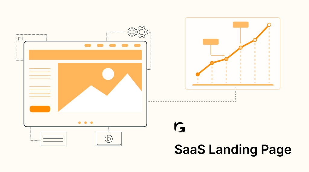
A landing page is a single web page designed with a specific purpose in mind, usually to persuade visitors to take a particular action. It serves as the entry point for users who click on an advertisement or a search engine result.
Landing pages are often used in marketing campaigns to convert visitors into leads or customers by encouraging them to complete a specific action, such as making a purchase, signing up for a newsletter, or downloading a resource.
These pages are carefully crafted to be concise, focused, and visually appealing, with clear calls to action (CTAs) guiding users towards the desired outcome. Effective landing pages typically have minimal distractions, relevant content, and compelling offers to entice visitors to engage further with the business or organization behind the page.
Why do you need a landing page?
A landing page serves as a critical component of any online marketing strategy, offering numerous benefits that can significantly enhance the effectiveness of your campaigns. Below are the primary reasons why you need a landing page:
| Reason | Explanation |
| Lead generation | Landing pages are designed to capture visitor information through lead generation forms, enabling businesses to collect valuable data and contact details from potential customers interested in their products or services. |
| Conversion optimization | By providing a focused environment with clear calls to action (CTAs), landing pages help optimize conversion rates by guiding visitors towards specific actions, such as making a purchase, signing up for a trial, or downloading a resource. |
| Targeted messaging | Landing pages allow for the customization of content and messaging based on different audience segments or marketing campaigns, ensuring that visitors receive relevant information tailored to their needs and interests. |
| Enhanced user experience | With minimal distractions and a streamlined layout, landing pages offer a seamless and intuitive user experience, making it easier for visitors to navigate the page and understand the value proposition presented to them. |
| Measurable results | Through the use of analytics and tracking tools, landing pages provide valuable insights into visitor behavior, conversion rates, and campaign performance, allowing businesses to measure the effectiveness of their marketing efforts and make data-driven decisions. |
| A/B testing capabilities | Landing pages facilitate A/B testing experiments, enabling businesses to compare different elements such as headlines, images, or CTAs to identify the most effective combinations and continuously improve campaign performance. |
| Alignment with campaign objectives | By aligning the content and design of landing pages with specific campaign objectives and target audience preferences, businesses can ensure consistency across their marketing channels and maximize the impact of their promotional efforts. |
How do you structure a good landing page?
Structuring a good landing page involves careful planning and attention to key elements that contribute to its effectiveness in converting visitors into leads or customers. Here’s a breakdown of the essential components and best practices for structuring a compelling landing page:
- Clear value proposition: Begin with a concise and compelling headline that communicates the unique value proposition or offer to visitors. Use subheadings and brief, persuasive copy to further elaborate on the benefits of your product or service.
- Engaging visuals: Incorporate high-quality images, videos, or graphics that reinforce your message and capture the audience’s attention. Visual content can help convey information quickly and enhance the overall appeal of the landing page.
- Focused content: Keep the content focused and relevant to the intended audience and campaign objective. Avoid clutter and unnecessary distractions that could detract from the primary call to action (CTA).
- Lead capture form: Include a prominent lead capture form that collects essential information from visitors, such as their name, email address, and any other relevant details. Keep the form fields minimal to reduce friction and encourage conversions.
- Compelling call to action (CTA): Design a clear and compelling CTA that prompts visitors to take the desired action, whether it’s making a purchase, signing up for a A/B testing: trial, or downloading a resource. Use persuasive language and contrasting colors to make the CTA stand out.
- Social proof: Incorporate testimonials, reviews, or trust badges to build credibility and reassure visitors about the quality and reliability of your offering. Social proof helps alleviate concerns and encourages trust among potential customers.
- Mobile optimization: Ensure that the landing page is optimized for mobile devices, with a responsive design that adapts to different screen sizes and resolutions. Mobile optimization is crucial for providing a seamless user experience and maximizing conversions.
Continuously test and optimize various elements of the landing page, such as headlines, CTAs, and imagery, through A/B testing experiments. Analyze the performance metrics and iterate on the design to improve conversion rates over time.
11 SaaS landing page best practices for higher conversion
Creating a landing page for your Software as a Service (SaaS) product requires careful planning and attention to detail. Here are eleven best practices to help you optimize your SaaS landing pages for higher conversion rates:
- Clear value proposition
- Minimalistic design
- Compelling images
- Highlight key features
- Social proof
- Clear Call-To-Action (CTA)
- Use of trust signals
- Mobile optimization
- A/B testing
- Clear pricing information
- Follow-up sequence
1. Clear value proposition
A compelling headline and concise copy should vividly articulate how your SaaS solution addresses a specific pain point or fulfills a need for your target audience. Clearly communicate the unique value proposition to entice visitors to explore further.
2. Minimalistic design
Simplicity is key. Opt for a clean and uncluttered design to prevent overwhelming visitors. Effective use of white space helps draw attention to crucial elements like your headline, call-to-action (CTA), and product features, facilitating seamless navigation.
3. Compelling images
High-quality visuals showcasing your SaaS product in action or highlighting its key benefits can significantly enhance user engagement. Visual appeal captures attention swiftly and communicates your product’s value proposition more effectively.
4. Highlight key features
Outline the core features and functionalities of your SaaS product prominently, emphasizing how they directly address the pain points of your target audience. Utilize bullet points or icons for easy comprehension and quick scanning.
5. Social proof
Integrate testimonials, case studies, or customer logos to build trust and credibility. Positive feedback from satisfied customers serves as powerful social proof, assuaging doubts and encouraging potential users to take action.
6. Clear Call-to-Action (CTA)
A prominent and action-oriented CTA guides visitors towards the desired action, be it signing up for a free trial, starting a demo, or downloading a resource. Employ compelling language that prompts immediate engagement.
7. Use of trust signals
Incorporate trust signals such as security badges, industry certifications, or awards to instill confidence in your SaaS offering. These signals reassure visitors about the reliability and credibility of your product, fostering trust and credibility.
8. Mobile optimization
Ensure a seamless user experience across various devices by optimizing your landing page for mobile responsiveness. With a growing number of users accessing the internet via smartphones and tablets, mobile optimization is imperative for maximizing conversions.
9. A/B testing
Regularly conduct A/B tests to experiment with different elements of your landing page, including headlines, CTAs, imagery, and form fields. Analyze performance data to identify optimal combinations and continuously refine your approach.
10. Clear pricing information
Transparently present pricing plans and their respective features, aiding visitors in making informed decisions. Clearly outlining pricing details eliminates ambiguity and facilitates smoother conversion journeys for potential customers.
11. Follow-up sequence
Implement a structured follow-up sequence to nurture leads who haven’t converted yet. Leveraging email marketing automation, send targeted follow-up messages like reminders, educational content, or exclusive offers to encourage conversions.
To wind up
Crafting an effective SaaS landing page requires a clear value proposition, minimalistic design, compelling imagery, and social proof to build trust. Emphasizing key features, a prominent CTA, trust signals, and mobile optimization are crucial for driving conversions. Regular A/B testing and transparent pricing information further enhance the user experience and decision-making. Additionally, implementing a follow-up sequence helps nurture leads for higher conversion rates.
Revv Growth offers comprehensive SaaS marketing solutions, leveraging strategic approaches to optimize landing pages, drive traffic, and maximize conversions. With tailored strategies and expert insights, Revv Growth empowers SaaS businesses to achieve scalable growth and sustainable success.
FAQs
1. What is the importance of a clear value proposition on a SaaS landing page?
A clear value proposition communicates the unique benefits and solutions that your SaaS product offers to potential customers, helping them understand why they should choose your product over competitors’.
2. How can you optimize the headline of a SaaS landing page for better conversion?
The headline should be concise, attention-grabbing, and clearly communicate the primary benefit or solution offered by your SaaS product.
3. Why is it important to minimize form fields on SaaS landing pages?
Minimizing form fields reduces friction and makes it easier for visitors to complete the desired action, such as filling out a contact form or signing up for a trial, leading to higher conversion rates.
4. What role does A/B testing play in optimizing SaaS landing pages for higher conversion?
A/B testing allows you to experiment with different elements of your landing page, such as headlines, visuals, CTAs, and layouts, to identify which variations perform best and continually improve conversion rates.
5. Why is it important to regularly analyze and optimize SaaS landing pages based on user behavior and feedback?
Regular analysis and optimization help you identify areas for improvement, address user concerns or pain points, and adapt to changing market dynamics, ultimately maximizing the effectiveness of your SaaS landing pages in driving conversions.


