Introduction
All people who work in the digital marketing field, like in:
- search engine optimization
- making websites easy to use
- writing for websites
- creating content
- studying website data or,
- improving website design
will need to explain bounce rate to their worried clients.
Studies show that up to 9 out of every 10 people who visit a website leave it quickly. Bounce rate is a number you see on Google Analytics that is not easy to understand compared to other numbers. Some visitors leave quickly because they feel misled by the website, whether the website is meant to or not, and some because they are getting impatient.
No matter why it happens, there’s a way to fix it. You can make fewer people leave your website quickly by encouraging them to look at other pages on your site.
What is a landing page bounce rate?
A “bounce” occurs when someone visits just one page on your site and then leaves. For example, if a visitor lands on your product page from a search engine and exits without navigating to another page, such as your contact information page, it’s considered a bounce.
Bounce rate is how often this happens compared to all visits. So, if out of every ten visitors to your product page, six leave without visiting a second page, then your product page has a bounce rate of 60%.
Is 60% a good bounce rate? It really depends on what your website is for and what’s normal for websites like yours.
Usually, you want a lower bounce rate because it means more people are looking at more than one page. But what’s okay for a bounce rate can change a lot depending on what your website does and what you want it to achieve.
What is a good landing page bounce rate?
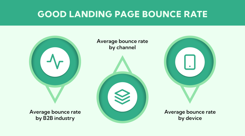
A “good” landing page bounce rate typically falls under or around 50%, but this can differ widely depending on the industry, target audience, and goals of the page.
For blogs, a bounce rate of around 70% might be considered good due to their content focus. In general, a rate between 25% and 55% is seen as satisfactory for most businesses.
- Average bounce rate by B2B industry
- Average bounce rate by channel
- Average bounce rate by device
Average bounce rate by B2B industry
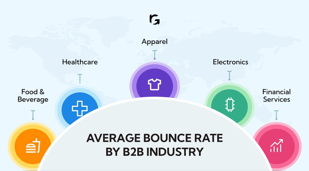
Food & beverage
The bounce rate in this sector stands around 56.62%, which might be attributed to visitors quickly finding the information they need, such as location and hours.
Healthcare
Websites in the healthcare sector have an average bounce rate of 58.29%, possibly due to users finding specific information quickly or seeking reliable health information.
Apparel
This industry shows a relatively lower average bounce rate of 45.68% to 46.97%, likely due to the engaging visual content and immersive brand experiences that encourage exploration.
Electronics
The average bounce rate is about 54.54%, reflecting a user base that often seeks specific information or product specifications and leaves once their needs are met.
Financial services
This industry has an average bounce rate of 51.71%, suggesting a mix of users finding what they need quickly and engaging content that keeps others exploring.
Benchmarking against similar businesses or industry averages is recommended, as the appropriateness of a bounce rate can greatly depend on the context of your specific industry and audience.
Average bounce rate by channel
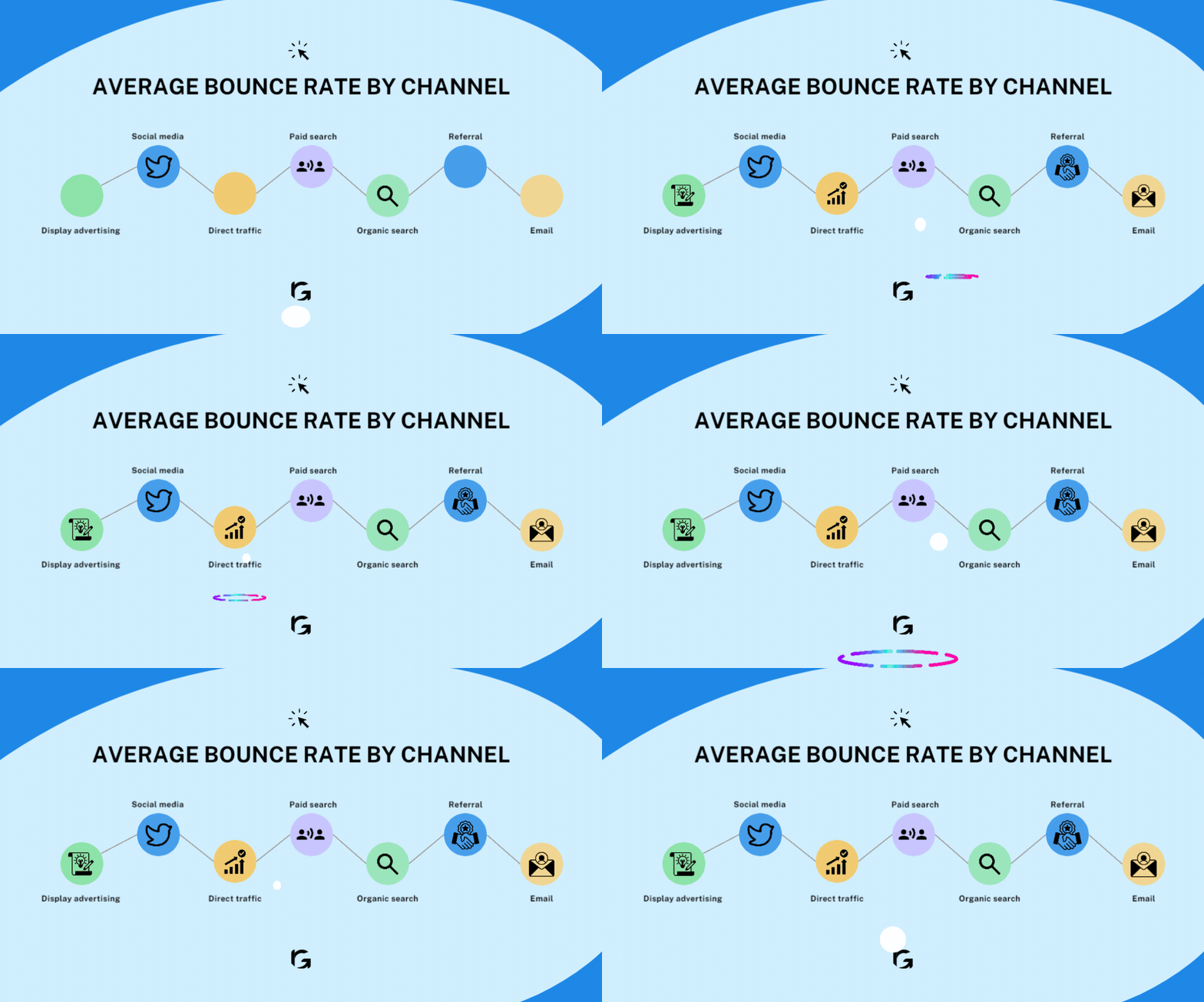
Bounce rates differ by the channel through which visitors arrive at your landing page. Here’s a concise summary of the average bounce rates by different channels based on industry benchmarks:
Display advertising
The highest average bounce rate at 56.50%, indicating that visitors coming from banner ads and other display advertising are more likely to leave without engaging further with the site.
Social media
Bounce rate averages around 54%, which is relatively high. This could be due to users returning to their social media activities after viewing the linked content.
Direct traffic
Visitors who arrive directly at a site have an average bounce rate of 49.90%. These users may have a specific purpose or more familiarity with the site, leading to slightly lower bounce rates.
Paid search
This channel sees an average bounce rate of 44.10%, suggesting that paid search campaigns might be effectively targeting and engaging users.
Organic search
Visitors coming from unpaid search results have an average bounce rate of 43.60%, indicating a good level of engagement as these users are likely looking for something specific.
Referral
With an average bounce rate of 37.50%, referral traffic, which comes from links on other websites, tends to engage well with the content.
The lowest average bounce rate is from email marketing at 35.20%. This highlights email marketing’s effectiveness in engaging and retaining visitors, likely due to the targeted nature of email campaigns.
Average bounce rate by device
The average bounce rate varies by device, with notable differences between mobile, desktop, and tablet usage.
For mobile users, the average bounce rate is reported to be 56.8%, desktop users have an average bounce rate of 50%, and tablet users have a 51.6% bounce rate.
Another study highlights that mobile bounce rates are roughly 10% to 20% higher than those of desktop bounce rates.
5 Unnoticed reasons why your landing page can have a higher bounce rate
Improving your landing page can help keep visitors around longer. Sometimes, the problems aren’t obvious. Here are five simple reasons your landing page might be turning people away:
- Expectations don’t match
- Too many choices
- Loading speed is slow
- Doesn’t feel trustworthy
- Not mobile-friendly
1. Expectations don’t match
If people come to your page expecting one thing but find something else because of confusing ads or headlines, they’re likely to leave. Make sure your ads and landing page clearly match up.
2. Too many choices
If your page has too many links or options, it can be overwhelming. Your landing page should focus on getting visitors to do just one main thing, like signing up or buying a product.
3. Loading speed is slow
If your page takes too long to load, people won’t wait around. Make sure your images aren’t too big and that everything on your page is optimized for quick loading.
4. Doesn’t feel trustworthy
People want to feel safe on your page. If you don’t have reviews, testimonials, or security badges, they might not trust you enough to stay or buy something.
5. Not mobile-friendly
A lot of people browse the internet on their phones. If your page doesn’t work well on mobile, those visitors might leave. Make sure your page looks good and works well on all devices.
How to calculate landing page bounce rate?
To calculate the bounce rate of your landing page, follow these two steps:
Find your numbers: Look at how many visitors left your site from the landing page without visiting other pages (single-page sessions) and the total number of people who started their visit on that page (entries).
Do the math: Divide the number of single-page sessions by the total entries, then multiply by 100 to get the percentage.
For example, if you have 100 single-page sessions and 200 total entries, your bounce rate is (100/200) * 100 = 50%.
You can use tools like Google Analytics to automatically get these numbers and calculate your bounce rate, helping you see if your landing page keeps visitors interested.
How to reduce the bounce rate for your landing page?
Creating an inviting digital space that speaks to their needs and interests is also important to reduce the bounce rates.
Here’s how to do that:
- Improve content readability
- Optimize page load time
- Design for easy navigation
- Use a responsive design
- Employ white space
- Improve your CTA
- Use high-quality images and videos
- Avoid popups or use them sparingly
- Structure your user experience
- Ensure font readability
- Add related posts
- Customize your 404 pages
1. Improve content readability
Break your text into smaller, bite-sized pieces. Use headings to organize topics clearly, bullet points to highlight key points, and mix in images or quotes to add interest.
2. Optimize page load time
Patience is in short supply these days, especially online. If your page takes ages to load, visitors will likely give up and go elsewhere. Aim to make your page pop up almost instantly. In technical terms, try for it to appear in three seconds or less.
3. Design for easy navigation
Design your site’s menu and layout so it’s clear where to find the important information, like your products, services, or contact info.
4. Use a responsive design
More people browse on their phones than ever before. Make sure your site looks just as good on a small screen as it does on a big one. This means adjusting the design so it’s easy to navigate no matter the device.
5. Employ white space
Not everything on your page needs to be packed with information. Spaces without text or images (white spaces) give visitors a break and help draw their attention to what’s most important—like your call to action or a particular piece of content.
6. Improve your CTA
Tell visitors exactly what you want them to do in a way that’s hard to resist. Whether it’s to sign up for a newsletter, make a purchase, or download a guide, your call to action should be loud and clear.
7. Use high-quality images and videos
People love to watch and look at interesting visuals. Use high-quality images and videos that relate to your text to keep visitors engaged and interested in what you have to say.
8. Avoid popups or use them sparingly
While pop-ups can be useful for announcements or offers, they can also be annoying if not used wisely. If you decide to use them, make sure they’re not disruptive or off-putting to your visitors.
9. Structure your user experience
Don’t make visitors guess where to find information. Use a clear and simple menu that helps them find what they’re looking for fast. Removing clutter from your navigation can make the whole experience more pleasant.
10. Ensure font readability
Tiny text is a strain on the eyes. Go with a font size that’s easy to read without zooming in. Around 18 pixels is generally a good size for most online content, making it accessible to more people.
11. Add related posts
Keep visitors engaged by offering them more of what they came for. At the end of articles or posts, link to related topics they might find interesting. This can keep them browsing your site longer.
12. Customize your 404 pages
A dead-end on your site can be frustrating. Customize error pages (like the “404 not found” page) to guide visitors back to useful content or to search for what they were looking for.
Wrap up
Bounce rate shows if people like your pages and find them useful.
But there’s more to look at.
Your website’s success depends on other things too—like the words you use, links to your site, search engine results, and so on. When you check your bounce rate, also look at how long people stay, where they come from, and what they use to visit your site. Make sure what you offer matches these things. You might find ways to make your bounce rate better.
Want to know more and solve your bounce rate problems? Get in touch with us and let’s sort it out!

