Introduction
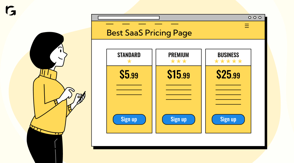
Every detail of your online presence matters, and your pricing page is no exception. It’s not just a place to list prices; it’s a strategic tool that can make or break your conversion rates. When potential customers land on your pricing page, they’re often on the verge of making a decision. This is your moment to communicate your value and convert interest into action clearly.
A high-converting SaaS pricing page requires careful planning and a deep understanding of pricing psychology. Are you effectively conveying each plan’s unique value? Are your call-to-action buttons strategically placed to guide the user journey?
This blog will examine the details of creating a high-performing SaaS pricing page. We’ll explore examples from top SaaS companies like Slack, Mailchimp, and Zoom. From clear pricing tiers to psychologically effective positioning, you’ll find actionable insights to refine your pricing strategy and ensure your pricing page attracts visitors and converts visitors into loyal customers.
The impact of design on SaaS pricing pages
Design is a key factor in making SaaS pricing pages effective. A well-designed pricing page can significantly improve conversion rates. By providing a seamless user experience and precise information, you reduce bounce rates and make it easier for users to choose a plan. Good design makes users feel more comfortable and confident in their decisions, leading to higher conversion rates and more satisfied customers.
Essential elements and tips for optimizing SaaS pricing pages
Creating a high-performing SaaS pricing page involves more than just listing your product’s prices. It’s about presenting the information in a way that is clear, compelling, and easy to understand.
Here are some essential elements to include and tips to help you optimize your pricing page for better conversions.
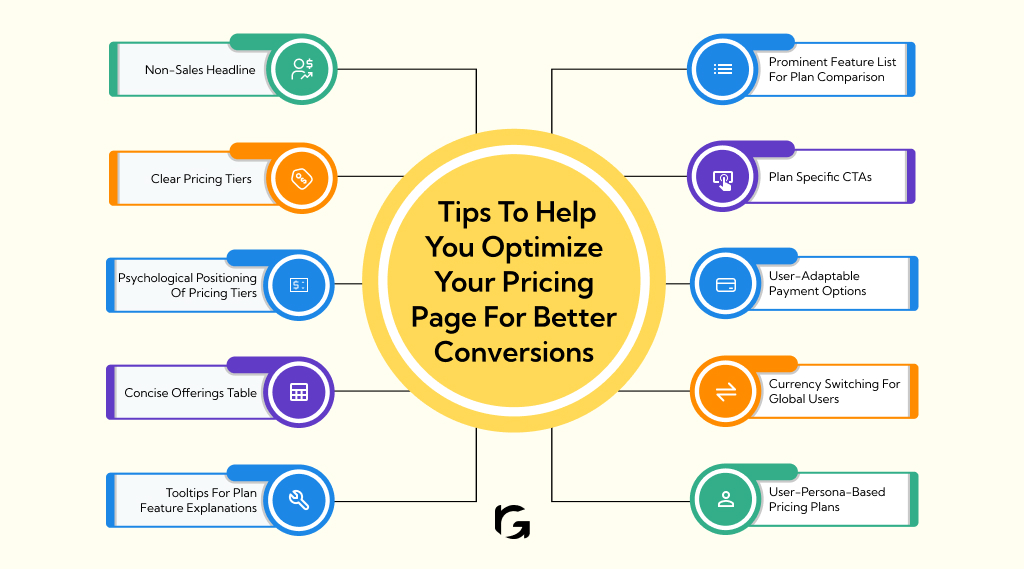
- Non-sales headline
- Clear pricing tiers
- Psychological positioning of pricing tiers
- Concise offerings table
- Tooltips for plan feature explanations
- Prominent feature list for plan comparison
- Plan specific CTAs
- User-adaptable payment options
- Currency switching for global users
- User-persona-based pricing plans
Non-sales headline
Make your headline impactful, as it’s the first thing visitors notice. It should be clear and focus on the benefits rather than sounding too salesy.
Tip: Highlight the primary benefit or value proposition of your service. For example, instead of “Affordable Plans,” try “Save Time and Money with Our Flexible Pricing.”
Clear pricing tiers
Offering multiple pricing options helps cater to different needs. You want users to buy the Hero plan, the Decoy makes it look more attractive, and the Anchor shows it as the best value.
Tip: Clearly outline the benefits of each tier. For instance, if your Hero plan includes premium support, make that stand out.
Psychological positioning of pricing tiers
Use psychological pricing strategies to guide users toward the desired plan. Highlight the best value or most popular plan to influence decisions.
Tip: Use visual cues like badges or different colors to draw attention to the most recommended plan.
Concise offerings table
A clear and concise offerings table helps users quickly understand what each plan includes. Don’t overload potential customers with too much information.
Tip: simple, concise language. Break down features into easily digestible bullet points.
Tooltips for plan feature explanations
Use tooltips to give extra details without making the page look cluttered. They can help clarify features and benefits.
Tip: Ensure tooltips are brief and informative. For example, if a plan includes “Priority Support,” a tooltip could explain, “Get answers within 2 hours.”
Prominent feature list for plan comparison
A detailed feature list allows users to compare plans easily. Highlight the unique features of each plan to help users make informed decisions.
Tip: Use checkmarks and icons to differentiate features visually. Highlight any exclusive features prominently.
Plan specific CTAs
Each plan should have its call-to-action (CTA) that speaks directly to the benefits of that specific plan.
Tip: Use action-oriented language like “Get Started” or “Choose Plan” instead of generic terms like “Buy Now.”
User-adaptable payment options
Providing various payment options can meet diverse customer needs. Some may prefer monthly payments, while others might opt for annual billing.
Tip: Provide both options and clearly show the savings for annual payments.
Currency switching for global users
If you have a global customer base, offering currency switching can make it easier for users to understand pricing.
Tip: Provide easy currency conversion options so users can view prices in their local currency.
User-persona-based pricing plans
Tailoring your pricing plans to specific user personas can improve relevance and conversion rates. Understand your different user segments and address their unique needs.
Tip: Create plans specifically addressing different user groups, such as startups, enterprises, or individual professionals.
Top 7 SaaS pricing page examples
Exploring successful SaaS pricing pages can give you great ideas on what makes them effective and how you can apply these strategies to your pricing page. Here are seven top examples, each with a standout feature and tips on implementing similar strategies.
- Slack
- Mailchimp
- Google Workspace
- Asana
- Zoom
- Gusto
- ConvertKit
Slack
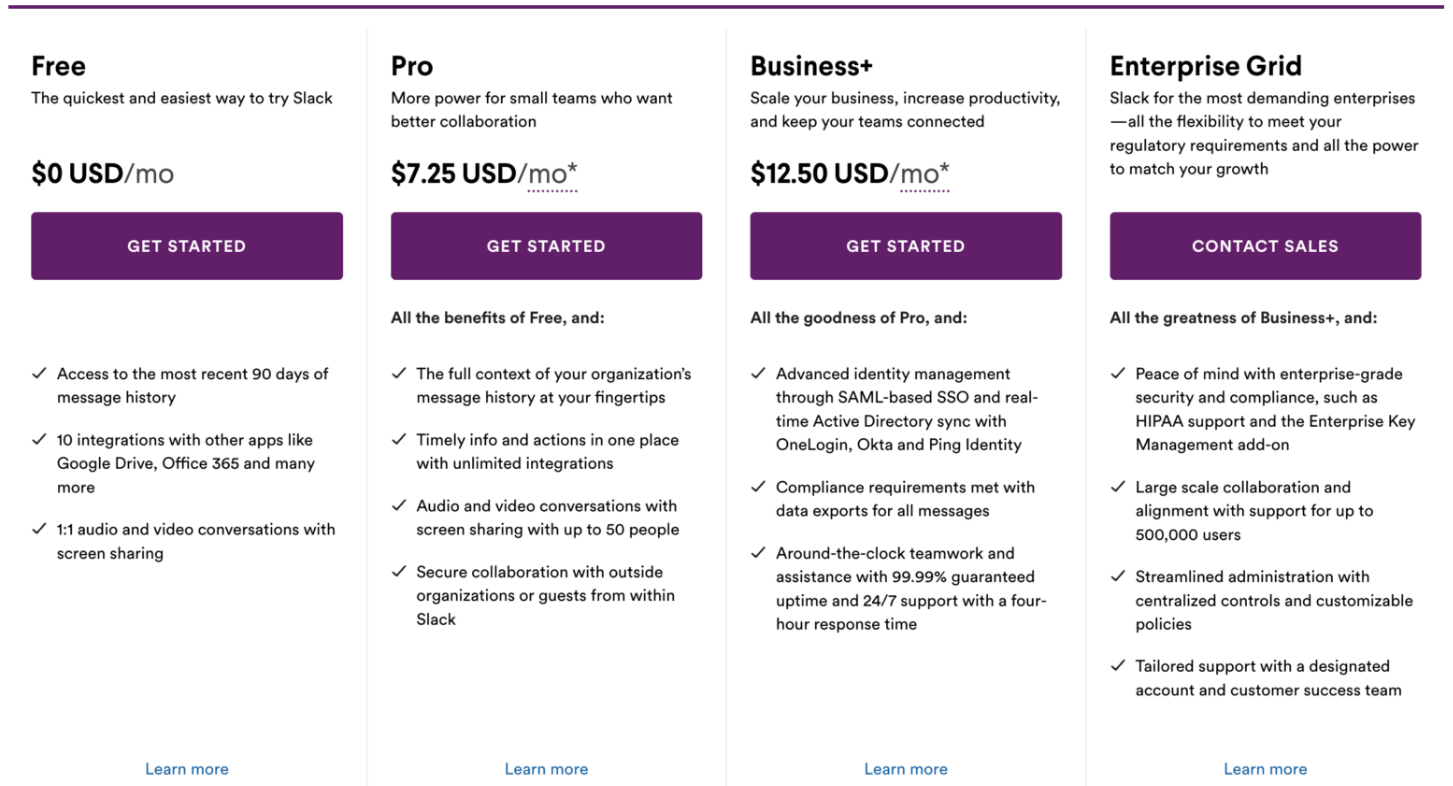
Slack’s pricing page is all about clarity and simplicity. They lay out the plans straightforwardly, clearly describing what each tier offers. Using icons and short, punchy text helps you quickly understand the benefits of each plan.
How You Can Do It: Use clear, concise language and avoid clutter. Use icons and bullet points to highlight key features, making it easy for your users to compare plans at a glance.
Mailchimp
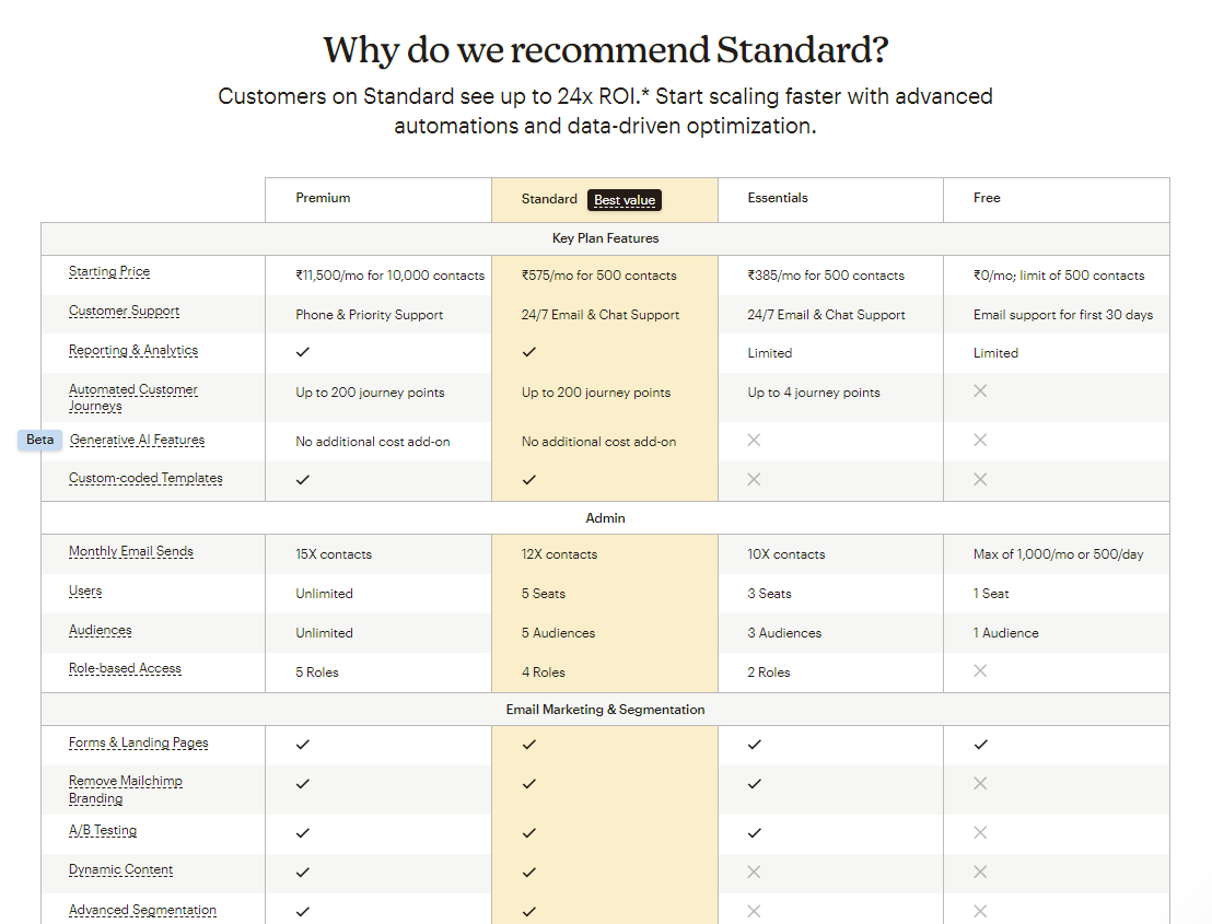
Mailchimp nails the user-friendly design. Their pricing page is clean, with easy-to-read tables and a prominent comparison chart. This setup makes it super simple to compare plans side by side and pick the one that fits best.
How You Can Do It: Design your pricing page with readability in mind. Use tables or charts to compare features across different plans easily. Keep the layout clean and organized.
Google Workspace
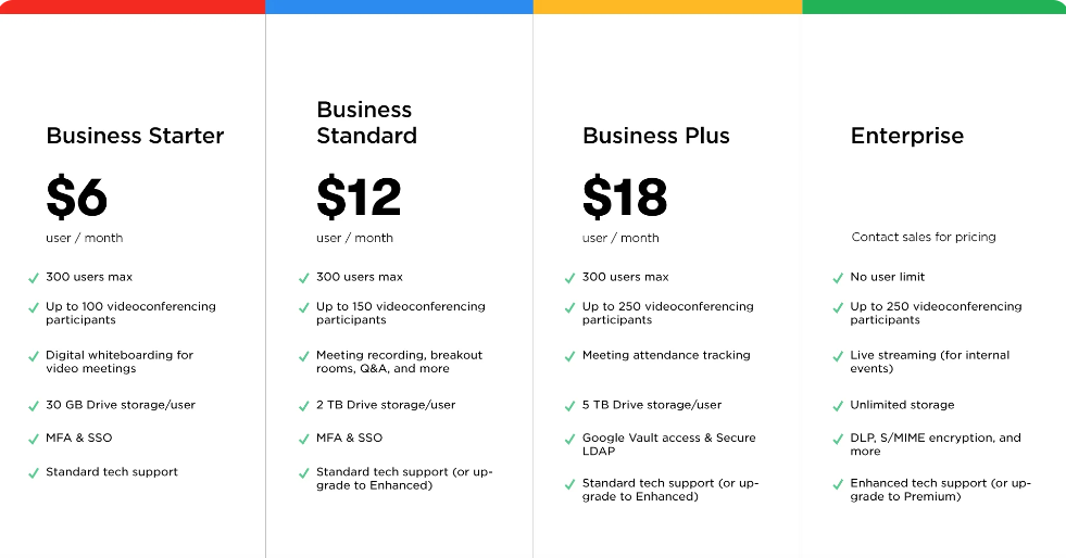
Google Workspace excels with its comprehensive feature breakdown. Each plan is detailed with a list of included features, making it clear what you’re getting at each price point. The page is organized using expandable sections.
How You Can Do It: Provide a detailed list of features for each pricing tier. Use expandable sections or tabs to present detailed information without overwhelming the user with too much at once.
Asana

Asana’s pricing page is a visual treat. Their visually appealing design uses vibrant colors to differentiate between plans. It’s both engaging and informative.
How You Can Do It: Use a visually appealing design that matches your brand. Utilise colors and icons to distinguish between different plans, making your page engaging and easy to navigate.
Zoom
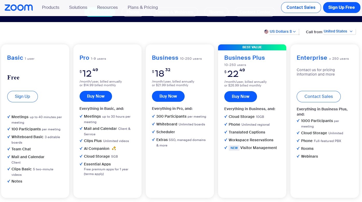
Zoom’s pricing page shines with its clear call-to-action (CTA) buttons. Each plan has a distinct CTA, making it easy for users to take the next step. The page also includes a handy FAQ section to address common questions.
How You Can Do It: Make sure your CTAs stand out with contrasting colors and clear, action-oriented text. Include an FAQ section on your pricing page to answer potential questions and reduce friction preemptively.
Gusto
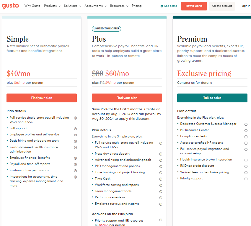
Gusto’s standout feature is its detailed plan comparison table. This table lists the features of each plan side by side, using checkmarks and visual aids to facilitate the comparison process.
How You Can Do It: Create a comparison table that clearly shows the differences between each plan. Use checkmarks, icons, and visual aids to make the comparison straightforward and visually appealing.
ConvertKit
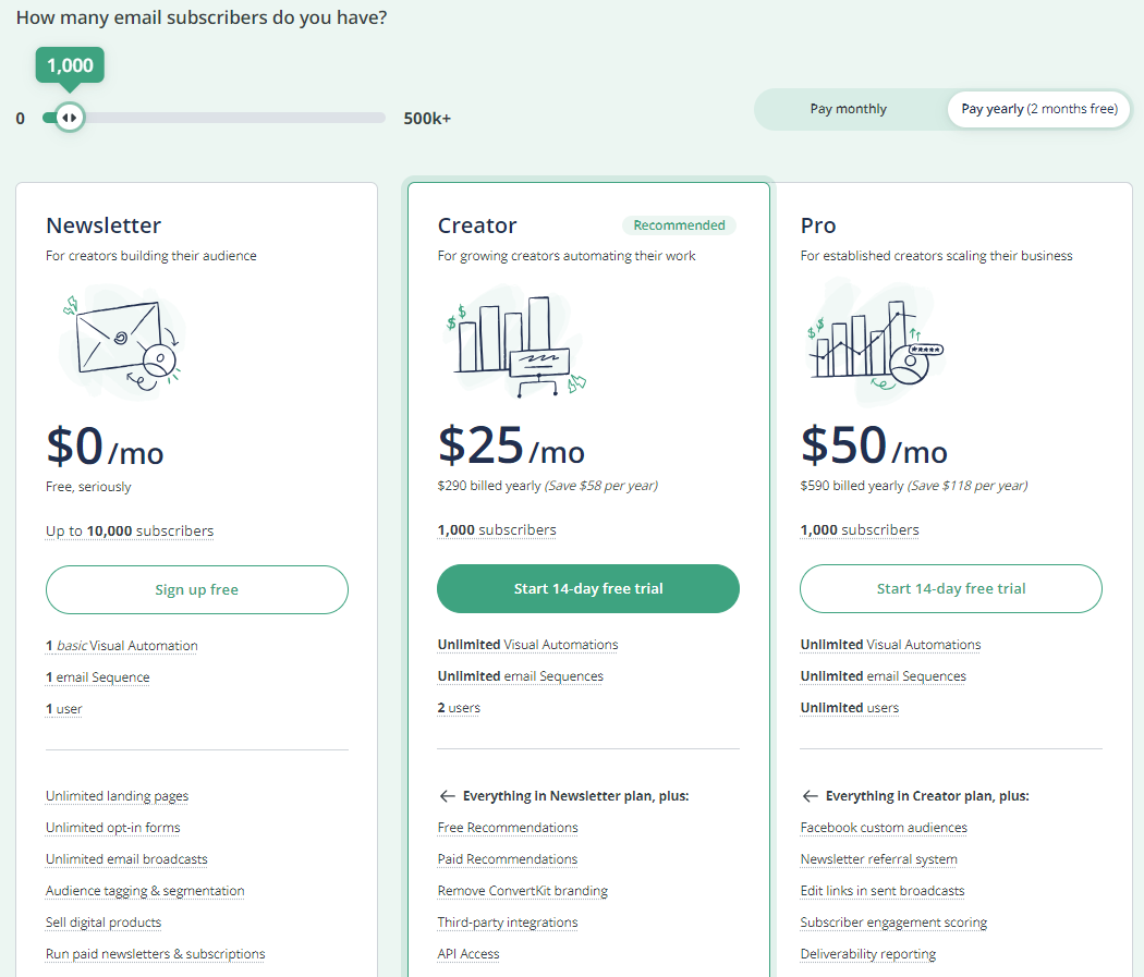
ConvertKit impresses with its personalized user journey. Their pricing page includes a calculator tool that helps users find the best plan based on their needs and subscriber count.
How You Can Do It: Add interactive elements like a pricing calculator to your page. This can help users personalize their experience and find the best plan for their needs.
Best practices for designing your SaaS pricing page
Creating an effective SaaS pricing page involves several best practices to ensure it is user-friendly and conversion-focused. Here are some key strategies to consider:
- Simplicity and clarity
- Highlighting popular or recommended plans
- Providing comparison tables
- Including testimonials and trust signals
- Ensuring mobile responsiveness
- Pricing page upsell tactics
- Personalized user journeys
Simplicity and clarity
Your pricing page should be simple and straightforward. Use clear headings, bullet points, and concise descriptions so users can quickly understand what you’re offering. Avoid clutter and complicated language that might confuse visitors.
Highlighting popular or recommended plans
Guide your users by highlighting the most popular or recommended plans. Use visual cues like badges or highlighting to make these plans stand out. This helps users make a decision without feeling overwhelmed by too many options.
Providing comparison tables
A comparison table is a great tool to show the differences between plans. Clearly list the features in each plan, making it easy for users to compare and choose the right one. Make sure the table is easy to read and not too complicated.
Including testimonials and trust signals
Build trust by adding customer testimonials and trust signals like security badges or certifications. Share specific, relevant testimonials that highlight your product’s real benefits.
Ensuring mobile responsiveness
Ensure your pricing page looks great and functions well on mobile devices. A responsive design improves the user experience for those accessing your page on their phones or tablets. Ignoring mobile responsiveness can turn away potential customers who browse on the go.
Pricing page upsell tactics
Highlight the extra value higher-tier plans offer to encourage users to choose them. Use persuasive language to show why upgrading is worth it, but avoid being too pushy, as this can scare away potential customers.
Personalized user journeys
Tailor the user experience based on individual needs and behaviors. Use insights from your data to create personalized journeys that guide users to the best plan for them. A ‘one size fits all’ approach often misses the mark for different types of users.
Conclusion
A well-designed pricing page is essential for converting visitors into paying customers. Focusing on simplicity, clear comparisons, and personalized user experiences can make your pricing page more effective and user-friendly.
Draw inspiration from successful examples like Slack, Mailchimp, and Zoom, and implement these best practices to optimize your page. Remember, the goal is to make it easy for potential customers to understand your offerings and feel confident in their decisions.
Partner with RevvGrowth to grow your B2B SaaS business. We help you craft tailored product marketing strategies, monitor key performance indicators, and stay ahead of the competition while boosting your revenue.
Ready to accelerate your growth? Connect with our team of experts today!
FAQs
1. How do you optimize SaaS pricing?
– Optimize SaaS pricing by analyzing user data, understanding customer value, and regularly testing different pricing strategies to determine what works best.
2. What is the best pricing model?
– The best pricing model depends on your product and target audience, but standard effective models include tiered pricing, per-user pricing, and usage-based pricing.
3. How many pricing tiers should a SaaS have?
– Typically, having three to four pricing tiers is ideal. It provides enough options without overwhelming potential customers.
4. How does A/B testing benefit a pricing page?
– A/B testing helps you find out what works best by comparing different versions of your pricing page. It can lead to higher conversion rates and better customer engagement.
5. What is the significance of CTAs on pricing pages?
– CTAs (Call-to-Actions) guide users to take the next step, such as starting a trial or purchasing a plan. They are crucial for driving conversions on your pricing page.

